ConstraintLayout 是 Support Library 裡面新增的一個 ViewGroup,從功能上來看非常強大,效能上不輸、甚至贏過 傳統的 Layout。因為放在 Support Library 裡面,幾乎市面上所有的手機都相容,就放心使用吧。
以往在建構複雜的畫面時,經常是 LinearLayout 與 RelativeLayout 等等相互組合,拼湊出相當深且複雜的樹狀 xml。略懂 View render 過程的都知道,效能就在層層的 measurement/layout 之中持續消耗。改用 ConstraintLayout 取代傳統 Layout 的複雜組合,把 xml 檔變得更加扁平,效率很容易就能提升。
粗看 ConstraintLayout 會覺得跟 RelativeLayout 有點像,其實它還能做到很多 RelativeLayout 做不到的事情。以下就稍微簡介 ConstraintLayout 的安裝與使用。
專案裡面加入 ConstraintLayout 由於 support libarary 已經被整併進 AndroidX ,所以 package name 跟安裝方法跟以前都不一樣,我覺得這是改進,比以前好理解了。目前 AndroidX 的是初版本是 1.0.0,你的所有 AndroidX library 都是用這個版號。也可以個別為 ConstraintLayout 換上比較新的版本
在 gradle 裡面照平常的步驟加進去 app/build.gradle 就行了
1
2
3
4
5
6
7
ext { + constraintLayoutLibVersion = '1.1.3' } .... dependencies { + implementation "androidx.constraintlayout:constraintlayout:${constraintLayoutLibVersion}" }
ConstraintLayout 的使用介紹 以我的理解,ConstraintLayout 可以取代 RelativeLayout(不知是否可以完全取代)。還可以做到一些 RelativeLayout 做不到的事情,舉例來說
利用 Guideline 來定位
透過 bias 對 view 的位置做一些偏移
用 ratio 的方式幫 view 調整大小
引入 chain 的概念,幫一組 views 做 Layout
Android Studio 還提供了非常強大的 Layout Editor 讓開發者透過拖拉就完成 ConstraintLayout 的建置。雖然我個人還是喜歡用手敲,但是要設定 chain 的時候,用 Layout Editor 的確比較快。
跟 RelativeLayout 相同的地方 在 RelativeLayout 裡面都是一個 View A 當作基準點,讓另外一個 View B 根據 View A 的位置來排版,或是對齊 Parent 的上下左右。這些在 ConstraintLayout 裡面都有相當直觀的參數對應
app:layout_constraintLeft_toLeftOf
app:layout_constraintLeft_toRightOf
app:layout_constraintRight_toLeftOf
….
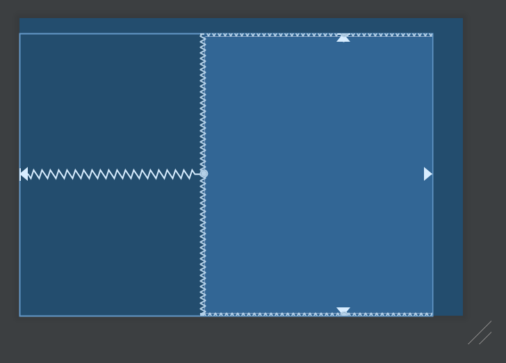
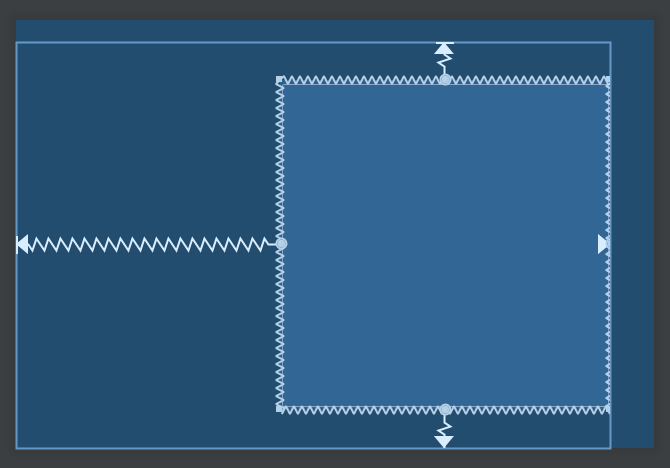
置中 要放到 parent 的中央,做法就有點不一樣。以水平置中為例,左邊對齊 parent 的左邊,右邊對齊 parent 的右邊,結果就是剛好會放在中間;垂直方向亦然。
1 2 3 4 5 6 7 <Button android:layout_width ="wrap_content" android:layout_height ="wrap_content" app:layout_constraintBottom_toBottomOf ="parent" app:layout_constraintEnd_toEndOf ="parent" app:layout_constraintStart_toStartOf ="parent" app:layout_constraintTop_toTopOf ="parent" />
結果看起來如上圖。彎曲的線條,代表的意義有點類似彈簧,這個 View 的上下左右都被以相同力道拉扯,所以剛好擺在中間。當然還能透過 margin 去做微調。
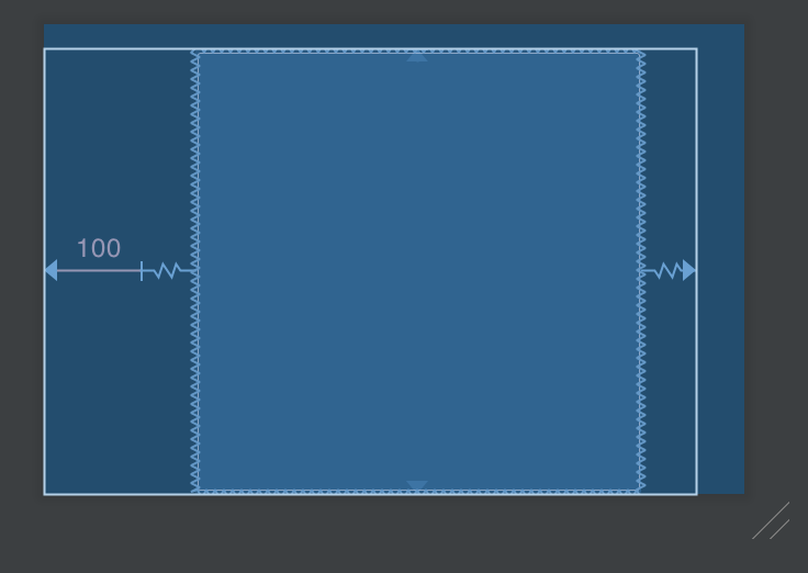
使用 Guideline Guideline 是非常簡單的 View,它總是把自己設為 View.GONE 變成看不見,因此只是用來輔助定位的物件,可以有 vertical 與 horizontal 兩種。有時候,我們並不總是希望把一堆元件都以 parent 為基準來排版,可能會想要畫上一條線,讓好幾個元件都針對這條線來排版,這就是 guideline 的用處
1 2 3 4 5 6 7 8 9 10 11 12 13 14 15 16 17 18 19 20 21 <android.support.constraint.Guideline android:id ="@+id/guideline" android:layout_width ="0dp" android:layout_height ="0dp" android:orientation ="vertical" app:layout_constraintGuide_begin ="100dp" /> <Button android:id ="@+id/btn_1" android:layout_width ="wrap_content" android:layout_height ="wrap_content" app:layout_constraintBottom_toBottomOf ="parent" app:layout_constraintEnd_toEndOf ="parent" app:layout_constraintStart_toStartOf ="@id/guideline" app:layout_constraintTop_toTopOf ="parent" /> <Button android:layout_width ="wrap_content" android:layout_height ="wrap_content" app:layout_constraintStart_toStartOf ="@id/guideline" app:layout_constraintEnd_toStartOf ="@id/btn_1" app:layout_constraintTop_toBottomOf ="@id/btn_1" />
上面的範例中,我新增了一個 Guideline,位置在 parent 的左側的 100dp(RTL 的時候會剛好相反)。接著讓原本置中的 button,把左側對齊新增的 guideline。另外還新增了一個按鈕,左側一樣是對齊 guideline,右側則是對齊 btn_01 的左方。在兩邊拉扯之下,這個 button 就會擺在 guideline 與 btn 的中間。這件事情用 RelativeLayout 就很難做到。
Guideline 也可以用百分比的方式來擺放,如果使用 app:layout_constraintGuide_percent="0.3" 就是從上方或是左方算起 30% 的地方放置 guideline。(不確定會不會有 RTL 的 issue)
使用 Barrier 柵欄(?),用來定義一個浮動的邊界,邊界會根據某一側的 Views 去調整自己的位置,另外一側的 view 則參考這個邊界進行排版
舉例來說,有 Button A, B 橫排在一起。有個 Button C 排在 A, B 的底下
如果 Button A, B 的高度會變化,那麼 Button C 的上緣究竟該對準哪個按鈕呢?這時候就是 Barrier 出場的時候。設定一個 Barrier 去參考 A, B 的底部,然後讓 Button C 去參考 Barrier
1 2 3 4 5 6 7 8 9 10 11 12 13 14 15 16 17 18 19 20 21 22 23 24 25 26 27 28 29 30 31 32 33 <Button android:id ="@+id/btn_a" android:layout_width ="wrap_content" android:layout_height ="wrap_content" android:text ="Button A" app:layout_constraintEnd_toStartOf ="@id/btn_b" app:layout_constraintStart_toStartOf ="parent" app:layout_constraintTop_toTopOf ="parent" /> <Button android:id ="@+id/btn_b" android:layout_width ="wrap_content" android:layout_height ="wrap_content" android:text ="Button B" app:layout_constraintEnd_toEndOf ="parent" app:layout_constraintStart_toEndOf ="@id/btn_a" app:layout_constraintTop_toTopOf ="parent" /> <androidx.constraintlayout.widget.Barrier android:id ="@+id/barrier" android:layout_width ="match_parent" android:layout_height ="0dp" app:barrierDirection ="bottom" app:constraint_referenced_ids ="btn_a, btn_b" /> <Button android:id ="@+id/btn_c" android:layout_width ="0dp" android:layout_height ="wrap_content" android:text ="Button C" app:layout_constraintEnd_toEndOf ="parent" app:layout_constraintStart_toStartOf ="parent" app:layout_constraintTop_toBottomOf ="@id/barrier" />
如此一來,不論 A 或 B 的高度怎麼變化,都能夠把 Barrier 往下推,連帶移動 Button C 的位置。當然 barrierDirection 除了 bottom 之外,要用 start, top, end, left, right 都可以。
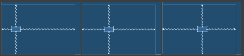
透過 bias 用百分比做位置的調整 回到第一個範例,最基本的置中按鈕。還可以調整 bias 這個數值,讓 view 的位置會依此做出比例上的傾斜。(不同於 margin 是設定一個固定的數值)。bias 是一個 0.00 ~ 1.00 的數值,有橫向的 layout_constraintHorizontal_bias 與垂直的 layout_constraintVertical_bias。
上圖就是同一個 button,把 layout_constraintHorizontal_bias 分別設定 0.15、0.35 與 0.55 三種數字的結果。影響著「計算旁邊的空間時,起始側應該要佔多少百分比」 。所謂起始側,水平的 bias 則是左方(RTL 會剛好相反),垂直方向則是上方。
沒有 match_parent 講到調整大小,首先要提醒 match_parent 與 match_constraint 。
從 Building interfaces with ConstraintLayout 可以看到這麼一段話
Match parent is not supported
ConstraintLayout 裡面不該使用 match_parent ,取而代之該使用 match_constraint 。要用 match_constraint ,其實也就只是設定成 0dp 就對了。(概念有點像 LinearLayout 裡面的 weight 與 0dp 的關係)。
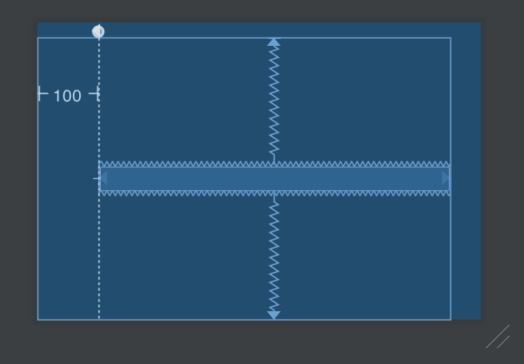
想做到原本的 match parent,指定長度為 0dp 之後,把 start/end 或是 top/bottom 綁到 parent 即可。舉例來說,我想把 button 的寬度,從 guideline 開始,填滿到畫面最右側
1 2 3 4 5 6 7 8 9 10 11 12 13 14 <android.support.constraint.Guideline android:id ="@+id/guideline" android:layout_width ="0dp" android:layout_height ="0dp" android:orientation ="vertical" app:layout_constraintGuide_begin ="100dp" /> <Button android:layout_width ="0dp" android:layout_height ="wrap_content" app:layout_constraintBottom_toBottomOf ="parent" app:layout_constraintEnd_toEndOf ="parent" app:layout_constraintStart_toStartOf ="@id/guideline" app:layout_constraintTop_toTopOf ="parent" />
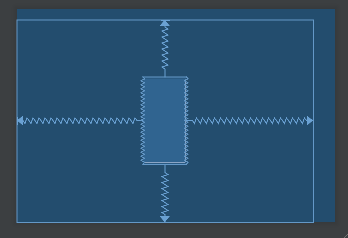
用 ratio 調整大小 根據螢幕大小縮放一個固定長寬比的 View 是常見需求。決定了一個方向的尺寸,還可以透過 ratio 來動態計算另一個方向的大小。
1 2 3 4 5 6 7 8 9 <Button android:id ="@+id/btn_1" android:layout_width ="100dp" android:layout_height ="0dp" app:layout_constraintBottom_toBottomOf ="parent" app:layout_constraintDimensionRatio ="1:2" app:layout_constraintEnd_toEndOf ="parent" app:layout_constraintStart_toStartOf ="parent" app:layout_constraintTop_toTopOf ="parent" />
上面的範例中,我把寬度固定為 100dp,讓高度動態調整,接著指定 width/height 比例為 1:2,於是高度就變成 200dp。
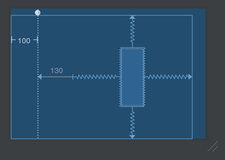
接著讓情況更複雜一點
1 2 3 4 5 6 7 8 9 10 11 12 13 14 15 16 17 <android.support.constraint.Guideline android:id ="@+id/guideline" android:layout_width ="0dp" android:layout_height ="0dp" android:orientation ="vertical" app:layout_constraintGuide_begin ="100dp" /> <Button android:id ="@+id/btn_1" android:layout_width ="wrap_content" android:layout_height ="0dp" android:layout_marginStart ="130dp" app:layout_constraintBottom_toBottomOf ="parent" app:layout_constraintDimensionRatio ="2:5" app:layout_constraintEnd_toEndOf ="parent" app:layout_constraintStart_toStartOf ="@id/guideline" app:layout_constraintTop_toTopOf ="parent" />
button 的寬度是 wrap_content
100dp 的地方加上一個垂直 guideline
從 guideline 往右邊加上 130dp 的 margin,當作起點。終點是畫面右側,把 button 擺在兩點中間
高度是動態調整,與寬度的比例為 2:5。
這麼複雜的情況,RelativeLayout 就很難做到了。依比例動態調整寬與高,是常見而以前不容易做到的需求,在 ConstraintLayout 中簡單許多。
更複雜的 ratio 用法 讓情況再複雜一點
如果兩邊都是 0dp,亦即寬與高都設定成 match_constraint ,ratio 該怎麼使用?可以透過 app:layout_constraintDimensionRatio="w,1:4" 這一類的寫法來指定基數為何。
w,1:4 的意思就是:希望 width 會動態調整,只要計算出高度,乘上 20% 當成是寬度h,1:2 的意思就是:希望 height 會動態調整,只要計算出寬度,乘上 50% 當成是高度
舉例來說
1 2 3 4 5 6 7 8 9 <Button android:layout_width ="0dp" android:layout_height ="0dp" android:layout_marginStart ="100dp" app:layout_constraintDimensionRatio ="w,1:1" app:layout_constraintBottom_toBottomOf ="parent" app:layout_constraintEnd_toEndOf ="parent" app:layout_constraintStart_toStartOf ="parent" app:layout_constraintTop_toTopOf ="parent" />
Button 的寬度與高度都指定為 match_constraint
Button 的上下左右都貼齊 parent
Button 左方有 100dp 的 margin
所以 View 的計算方法就會是先垂直貼齊 parent,計算出高度之後。再把這個高度設定到 width 上面。我們可以清楚地看見一個正方形。
如果把 margin 加大到 300dp,甚至可以看到 View 維持正方形,但是被推擠到外面去了。結果就是上圖。
維持 margin 為 300dp 的情況下,如果我們把 w,1:1 換成 h,1:1 呢?
結果就是上圖。計算方法為:整個畫面的寬度減去 300dp 之後當成 view 的寬度,而 height 為動態調整,設定成跟寬度一樣。
Group 比起其他元件,我覺得 Group 有點無聊。定義一個看不見的 View,當成數個 View 的集合,用來控制 Group 內 Views 的 visibility
1 2 3 4 5 6 7 8 9 10 11 12 13 14 15 16 17 18 19 20 21 22 23 24 <Button android:id ="@+id/btn_a" android:layout_width ="wrap_content" android:layout_height ="wrap_content" android:text ="Button A" app:layout_constraintEnd_toStartOf ="@id/btn_b" app:layout_constraintStart_toStartOf ="parent" app:layout_constraintTop_toTopOf ="parent" /> <Button android:id ="@+id/btn_b" android:layout_width ="wrap_content" android:layout_height ="wrap_content" android:text ="Button B" app:layout_constraintEnd_toEndOf ="parent" app:layout_constraintStart_toEndOf ="@id/btn_a" app:layout_constraintTop_toTopOf ="parent" /> <androidx.constraintlayout.widget.Group android:layout_width ="0dp" android:layout_height ="0dp" android:visibility ="invisible" app:constraint_referenced_ids ="btn_a, btn_b" />
以類別的繼承關係來說,Group 就是一個 View 的子類別,加了這東西就是會多佔用一點記憶體跟執行效率。以直覺來猜,如果控制的 views 只有一兩個,可能直接在程式碼裡面手動去操作還比較省事。此外,控制 visibility 我覺得比較偏向邏輯,把這個關係放進 layout xml 我自己是覺得滿怪的。所以我不太明白這了類別存在的意義
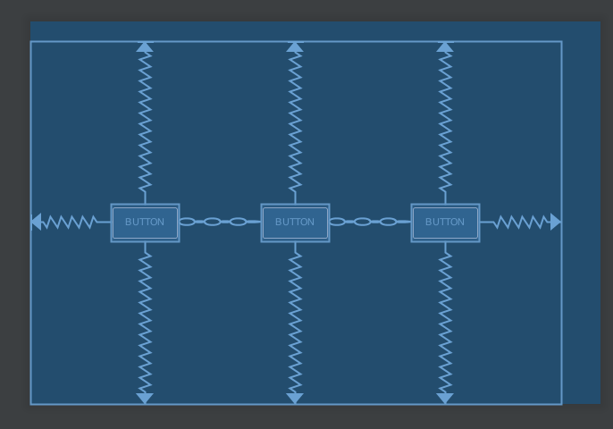
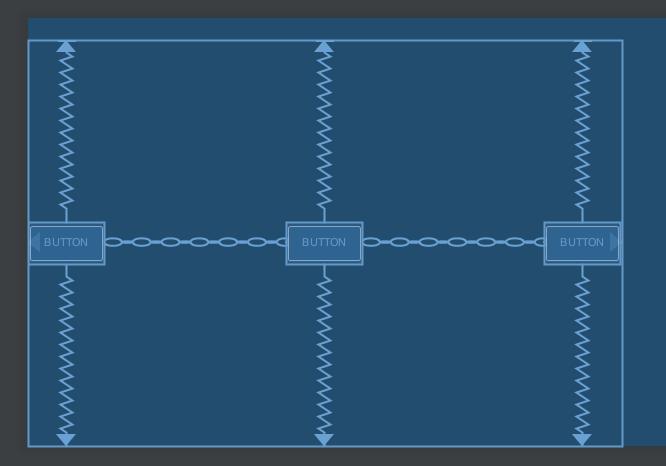
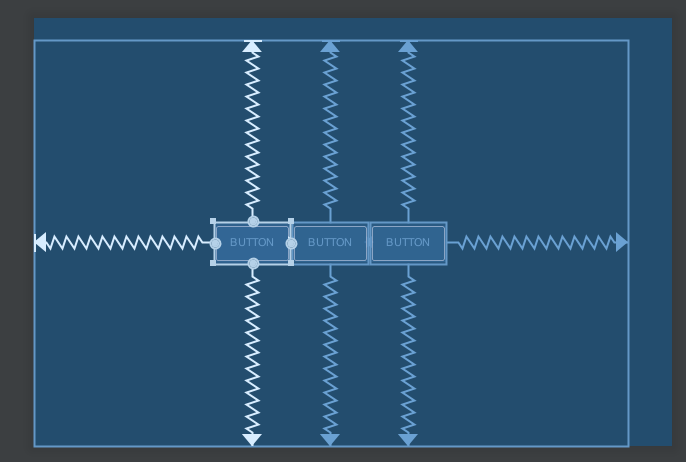
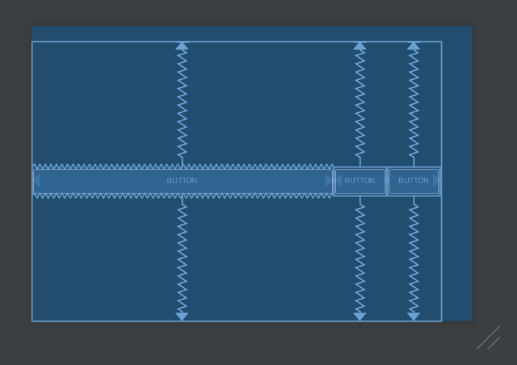
Chain 接著要介紹的概念就是 Chain。
1 2 3 4 5 6 7 8 9 10 11 12 13 14 15 16 17 18 19 20 21 22 23 24 25 26 27 28 29 <Button android:id ="@+id/button1" android:layout_width ="wrap_content" android:layout_height ="wrap_content" android:text ="Button" app:layout_constraintBottom_toBottomOf ="parent" app:layout_constraintEnd_toStartOf ="@+id/button2" app:layout_constraintStart_toStartOf ="parent" app:layout_constraintTop_toTopOf ="parent" /> <Button android:id ="@+id/button2" android:layout_width ="wrap_content" android:layout_height ="wrap_content" android:text ="Button" app:layout_constraintBottom_toBottomOf ="parent" app:layout_constraintEnd_toStartOf ="@+id/button3" app:layout_constraintStart_toEndOf ="@+id/button1" app:layout_constraintTop_toTopOf ="parent" /> <Button android:id ="@+id/button3" android:layout_width ="wrap_content" android:layout_height ="wrap_content" android:text ="Button" app:layout_constraintBottom_toBottomOf ="parent" app:layout_constraintEnd_toEndOf ="parent" app:layout_constraintStart_toEndOf ="@+id/button2" app:layout_constraintTop_toTopOf ="parent" />
在 xml 的屬性裡面,只會看得見水平與垂直的 chainStyle 這兩個屬性跟 chain 有關。而 chain 是一個抽象的概念,只要兩個 views 的頭尾相連,則會成為一個 chain;當然數個 views 頭尾相連也行。形成 chain 之後,每個 view 之間的鏈結方法變得不一樣了。
形成一個 chain 的時候,最左邊或是最上面的 view,稱之為 chain head 。給 chain head 指定 layout_constraintHorizontal_chainStyle 或 layout_constraintVertical_chainStyle 就能決定 chain 之中每個 view 的分佈方式。裡面的值可以是
spread: 預設值,如上圖。每個 view 分布的位置是平均分佈
spread_inside: 頭尾的 view 靠到最旁邊之後,中間的 view 平均分佈
最後就是回到 LinearLayout 的邏輯。把寬度設定成 0dp 之後使用 layout_constraintHorizontal_weight 就能像以前在用 LinearLayout 一樣,以 weight 指定這個 view 需要佔據剩下空間的多少權重;垂直方向的用法也一樣。上圖就是把第一個 Button 的寬度設定為 0dp,並且指定 weight 為 1
Examples 以下記錄一些常常遇到的排版需求,複製貼上的速度會比較快
在中央放一個 TextView 通常用來顯示某一個區塊的 Title
因為是 title,希望會置中
title 可能長或可能短,但是設計師通常會說「如果字串太長,就佔 60% 寬為極限」
我的方法是左右增加兩個 guideline,位置由百分比決定。然後把 TextView 的左右 align guideline,寬度為 wrap_content 並且指定 app:layout_constrainedWidth。我還刻意加了一個 drawable 進去,反正這也是常被要求的東西。
1 2 3 4 5 6 7 8 9 10 11 12 13 14 15 16 17 18 19 20 21 22 23 24 25 26 27 28 29 30 <androidx.constraintlayout.widget.Guideline android:id ="@+id/title_guideline_left" android:layout_width ="0dp" android:layout_height ="0dp" android:orientation ="vertical" app:layout_constraintGuide_percent ="0.2" /> <androidx.constraintlayout.widget.Guideline android:id ="@+id/title_guideline_right" android:layout_width ="0dp" android:layout_height ="0dp" android:orientation ="vertical" app:layout_constraintGuide_percent ="0.8" /> <TextView android:id ="@+id/title" android:layout_width ="wrap_content" android:layout_height ="wrap_content" android:drawableStart ="@android:drawable/arrow_down_float" android:drawablePadding ="6dp" android:gravity ="bottom" android:includeFontPadding ="false" android:singleLine ="true" android:text ="@string/common_back_to" app:layout_constrainedWidth ="true" app:layout_constraintBottom_toBottomOf ="parent" app:layout_constraintLeft_toLeftOf ="@id/title_guideline_left" app:layout_constraintRight_toRightOf ="@id/title_guideline_right" app:layout_constraintTop_toTopOf ="parent" tools:text ="@tools:sample/lorem/random" />
20190314 更新:修改關於 androidx 的部分,並加上一些範例
20211206 更新:加上 Barrier 跟 Group
若有寫錯的地方,還請到 twitter 提醒我一下,謝謝